Is paper dead? Denis Widmann says NO!
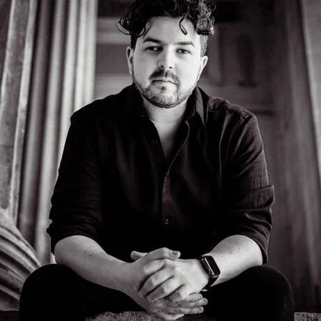
Denis Widmann
This award-winning graphics designer tells us why paper is still very much alive. He talks about his Campari project… and more. The article is particularly timely because Denis just snagged a Silver award at the European Design Awards June 1 in Naples.
Hi Denis, we met in Berlin at BCB and you seem so young. You have 16+ years of experience. How old are you?
31 – turning 32 in December this year. I started freelance work around 15.
What is your background? What did you study to get into this field?
The invitation
I attended art school very early on and did my A-Levels in Arts with very traditional Bauhaus based training, then continued to do my Bachelor’s Degree in Media and Communication Design in Munich and continued onto my Master’s Degree in Graphic Design at the University of Edinburgh, College of Art – one of the UKs oldest art schools.
You work with paper when so much is going digital. What is it about paper that still fascinates people?
You know in times where everything is digital, in which we are overflooded by moving pictures and our senses reduced to touching glass, people have a craving for tactile experiences. We are tactile beings after all. We learn and feel through touch. To grasp something comes from that. Understanding things by touching and feeling them. The first food you hold or the touch and care of a loving mother, all of this is deeply embedded in us humans. You don’t have to be an expert to realise when you’re holding something quality in your hands. Good paper or in general fine materials which create a. tactile experience, create pleasure through touch – it creates a sensual experience between the consumer and the brand. A valuable touching point (pun intended) which you won’t have with digital. Especially in luxury you need to trigger the senses. As with a good drink it’s the look and the smell, the feeling of the fine crystal glass and of course the taste which lifts a simple concoction to become an experience of its very own. The same applies to paper.
You did remarkable invitations for several Campari events. Walk me through the process.
There’s always the client’s brief and after that comes the research. Research of styles, possibilities, techniques. Then I draft up first ideas and concepts, pitch them to the client and depending on the feedback either refine the idea or finalise the design. After approval I create the print files and dielines for production and usually always produce a prototype which the client gets to see before production. We then choose material together and if all is approved – depending on quantity – either produce the job ourselves in my studio (small batches) or for larger scale projects pass it on to my production partners.
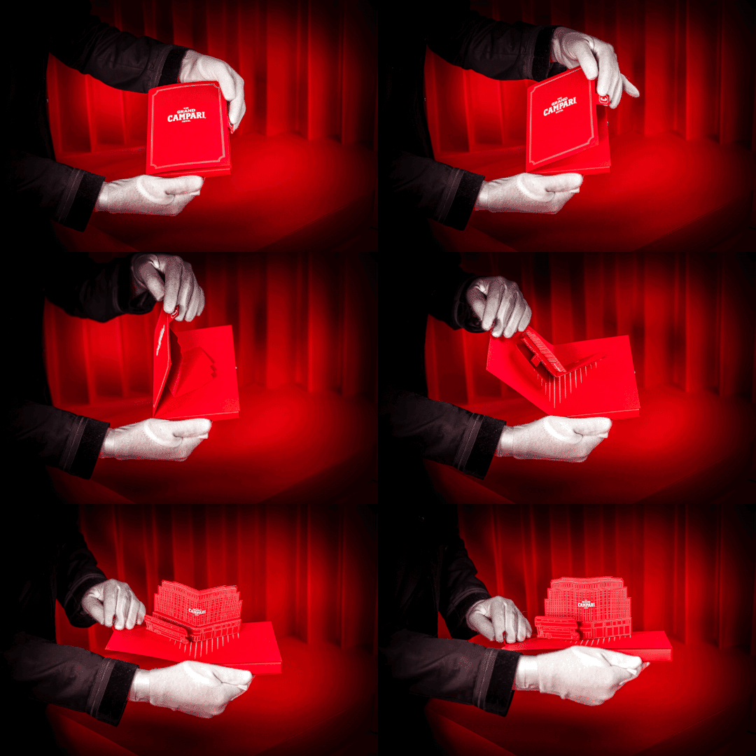
more of the invitation packet
How did you get the first contact with Campari?
It’s a funny yet lovely story. I was a teacher for Graphic Design at a Munich based University. I organised an exhibition for my students and their semester artwork. A good friend of mine who back at that time was working as the head of the local Hilton Hotel Bar got me in touch with Campari for a drink sponsorship of the event. This is how we first got in touch. After a while I met again with my then Campari contact and connected quite well over an espresso.
What was your first meeting like?
Refreshingly fun and relaxed. Just like the perfect aperitivo. ;-)
Did things change from the idea in the beginning and the final outcome?
A key to the Grand Campari Hotel
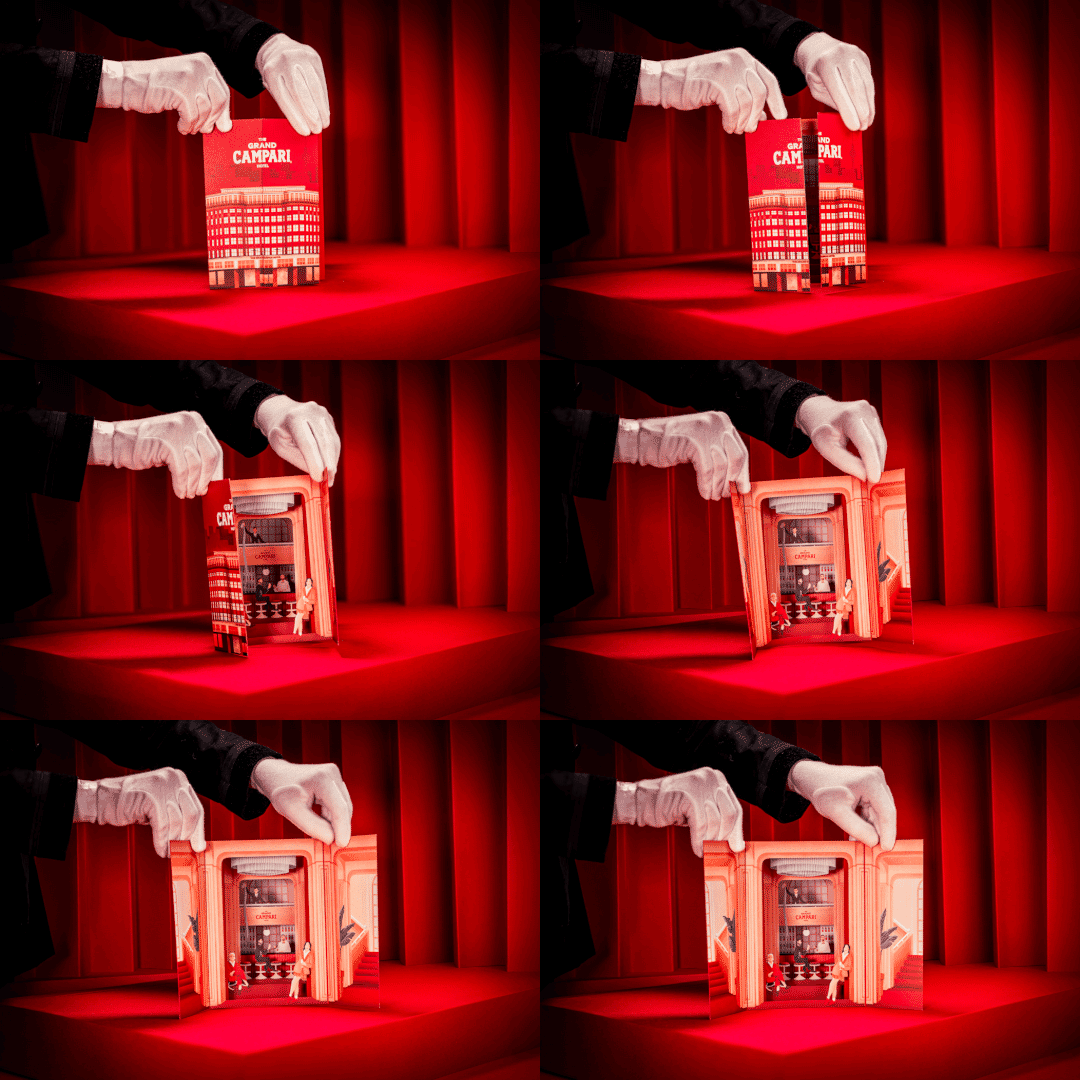
Several aspects did. Mostly details. If you have a vision, even if you plan it through and through meticulously, you will eventually encounter one or the other unforeseen problem or obstacle which you need to solve / overcome. In the case of the invitation and paper peep show it was both the magnetic closure, without which the invitation wouldn’t have shut as nicely as it does now and the painted edges of the peep show which otherwise would be white and thus clearly visible, taking significant attention away from the stars of the Grand Campari Hotel.
How do you come up with a first draft of your proposal?
It’s always based on the clients brief naturally and through research of course. Just like a good bartender, a good designer needs to listen and understand the needs and desires of the client. So client idea + research = first ideas. Anything can be inspirational, from walks outside to checking books, pinterest and so on. I sometimes have the best ideas in the shower actually. ;-)
I’m sure budgets must be high to create a project like this—did you have to do any convincing on why your project had the cost it did?
Can’t disclose. ;-)
What about the technical aspects involved? There must be a lot of laser cutting involved.
The inbtricate popout design of the peep show
still another of the many moving parts of the invitation
Technically it was quite the challenge to realise this project especially in the time given. Projects like this usually span over months and I realised this in a matter of a few weeks since time was short and the invitations had to be sent out globally. In terms of the technical aspects there’s quite the list actually.
Then as suggested by you there was laser cutting and die cutting. The peep-shows sleeve was then finished with white hotfoil stamping and in order to hide the white paper edges on the peep show, we digitaly scanned the colour of the red leporello sides and edge painted the sides of the stages to create this unified red impression throughout the piece. Both the invitation and paper-peep-show (you can refer to it as Victorian panorama as well) were assembled by hand. The whole project – from paper to print and assembly – was made locally in southern Germany.
built to surprise and delight
The accordion layered design is remarkable, What are the challenges of a project of this magnitude?
During the design process, I always create prototypes to make sure the production line knows exactly what to produce and yet there are always unforeseen challenges. In this case it was two things: the closure of the invitation and the edges of the paper peep show.
Since it was challenging to create the beautiful pop-up effect on the invitations it required several prototypes and during this process which always happens in close contact and exchange with our production partners, we realised that we need some closure mechanism, as otherwise the invitation wouldn’t lie flat but half opened. So we decided to include a magnetic closure on the side.
As for the paper peep show it was the white paper edges of the stage elements which we of course only saw once a final, full colour prototype was made by the printer to finalise and discuss any last details and changes. During the meeting we collectively decided to digitally scan the red of the leporello sides (accordion side parts) and use this exact colour to edge paint the peep show, thus hiding the white edges which otherwise would have definitely taken away quite a bit of the lovely overall look and feel of the design. Such things are often unforeseen.
Also on projects of this size it is always wise to keep a part of the budget for unforeseen challenges. This enables quick action thus saving both time and sorrow.
What could go wrong, and what did go wrong in the process? And how did you fix it?
under the C is a handy magnet to keep everything together
Luckily everything was fine apart from two unforeseen challenges which were luckily easy and quick to handle. But naturally there’s a lot that can go wrong on any project. That’s why good planning and structured execution in close collaboration with the client is the bread and butter of any project.
Now, getting away from Campari and on to some general questions: Do you have a technique that defines your studio?
What’s special for us and what certainly differentiates us from a lot of other studios is the fact that we produce quite a lot of things ourselves, e.g. we do our own letterpress printing in a workshop in Munich. Last year I invested in a new hotfoil press which allows us to create our own hotfoil stamping / embossing and debossing. So if you take a lovely bottle of whisky for example, the gold or Copper foiling is done using a metal die and hotfoil stamping.
Also we can produce fine art prints in museum quality up to a size of A2 in our Studio which is great for premium Photo prints, proofs and Art Prints. Furthermore, we produce small scale projects such as the Campari Seltz invitation fully inhouse using techniques such as plot, die cutting, hotfoil stamping, letterpress, paper crafting and traditional book binding.
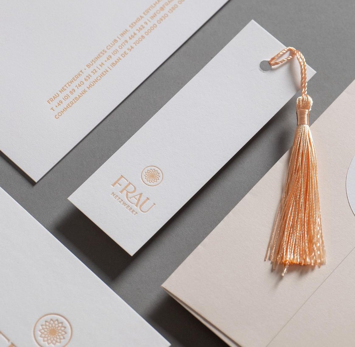
Embossed for Frau
It seems like business cards are becoming a thing of the past? Do you agree or disagree? Why?
Yes and no. There’s not a simple or direct answer to that. I would say that the usage has changed. I personally don’t believe in cheap print. I think “all or nothing”. Do it properly or leave it be. Same with print.
Cheap print looks and feels awful, it’s bad for the environment because it will end up in the bin anyway and the companies might potentially be more likely to not be able to pay their workers good / high wages.
This is why I think the whole field is transforming. In our digital screen dominated times, we want to touch quality materials. There’s this urge for touch since a glass screen doesn’t really satisfy our tactile senses.
I for example don’t give business cards to anyone. Sometimes when you connect with someone who’s like an acquaintance and just an addition to the network but not in a direct business context, linkedin might simply be better suited to connect. But if I feel that that this is an interesting potential new business partner or potential client, I leave a whole different impression if I had them not a cheaply printed card but something proper. Our cards are quite thick. They are made from 700 g/m2 thick paper made from 100 % cotton. They look great and they feel even better. That smooth feeling creates a tactile experience, pleasing our fingers. The current ones are duplex printed in black Letterpress for this lovely debossed, indented print that just looks great. Yet, these simple white cards with black print are an understatement in themselves. Quiet luxury. Pleasurable but not a show-off. So I think that especially for the premium market, a premium card is still good to have. It just leaves a different impression. But for digital and low end markets I suppose a direct linkedin request is probably more well suited. Luxury clients expect luxury if you want them to see eye to eye with you, so obviously you need to deliver on the first impression. ;-)
Campari’s iconic bottle from the 1930s
Even though you work with a sustainable paper company, how do you justify the use of paper in your projects?
There’s nothing to justify. Paper is a green and ecological material that can be used and recycled over and over and over again. A lot of papers we work with are even made from 100 % post consumer material.
The question is, why do people still justify to use so much plastic while we have so many great alternatives at hand these days?
For luxury there are four main materials: Glass, Paper, Metal and Fabric. Looking at current developments you could add organics as a fifth in which new compostable and recyclable compounds would fall in.
Sharla, you are an expert of the spirit and bar industry. Imagine if you spend several hundred Euros / Dollars on a lovely premium Single Malt. Don’t you expect an experience, a story and of course an extraordinary packaging? Would you think of the product the same and still be willing to spend the money, if that 300 $ Whisky would come in a PET plastic bottle? You likely wouldn’t. That’s why it comes in glass. We need labels for different markets and packaging due to legal requirements which vary from market to market and thus need to be easily changeable / applicable for the individual markets. So you need materials which allow you to do so, yet are not as harmful as others or even sustainable. That’s why you need paper.
Campari by the way, was the world’s first company to introduce a bottle that came without a label because all the details were stamped into the glass bottle during the bottle’s manufacturing. It was Campari Soda in the 1930’s.
The Inapa Jolly Paper challenge- packaging for chocolates
Have you ever used other materials besides paper in your projects?
Several. Metal such as brass or steel. Wood. Fabric. Glass. Stone. The possibilities are endless. That’s what differentiates me from several of my colleagues. I’m not a classic Graphic Designer who’s stuck behind the mac. I love to experiment and also craft things. Make the craziest ideas a thing.
My first ever use of metal for example, were large A3+ sized menus with a real 0.5 mm thin brass sheet inlay
for a luxury bar in Munich.
Do you use 3D printing?
I’ve used it before but currently we don’t.
What is the biggest challenge in general in running your business?
Time. Being self-employed and running your own business gives you all the freedom in the world but also all the responsibility. Jobs usually done by several teams from client acquisition, planning, budgeting, concept, design, production, book keeping, invoicing, hr, marketing etc. all needs to be done by you as a freelancer. What’s challenging for me sometimes is the sad fact that creativity sometimes comes short and only accounts for 20-40 % Percent of a project since all the other jobs take up a lot of time and energy.
How have communication methods changed in the past five years or so?
People realised thanks to the pandemic (yes the pandemic also had good effects on society!) that we don’t always need to sit next to each other in order to work and collaborate, be it in the office or in meetings. A lot has changed to digital, FaceTime calls now save us all countless hours being stuck in traffic on the way to meetings which are far better dealt with a FaceTime call anyways. Digital communication has drastically improved in an unforeseen speed. What otherwise would have taken us a decade to achieve in technological advancement and digital transformation happened over the course of two years. Collaboration and white-boarding tools have sparked from the ground like mushrooms. The great result is, that now, more than ever, my office is where my Mac (and iPhone) is. It allows me to work and travel, from wherever in the world literally. As long as there’s Internet, I can work. This saves time, money and nerves.
Downside: I feel like it also puts more stress on all of us since digitalisation, being surrounded by social media, digital devices and the fact that you can be available all the time from any place has its downsides and surely isn’t good on mental health if not dealt with correctly. I use my focus modes to shut off and get some digital detox.
You clearly work on products that create an emotion. Where do you get your inspiration?
Emotion is deeply rooted in good storytelling. If a brand or product lacks story, there’s usually zero to none emotional connection. So naturally I draw my inspiration from anything that tells a story.
This can be in a nice shop where products simply speak to me by being beautifully designed, but also nature, books, films and archives but most importantly it’s travel. As a designer you need to have an archive of styles in your head consisting of typography, colours, patterns, forms, styles etc. That archive only grows when you see things and “save” them in your head. You ultimately become better and learn thus prosper by seeing and questioning things. To me travel is the best way to achieve this. Drawing experience and inspiration from different places and cultures helps me to create things that are different and sometimes even new to my local audience.
To give you a comparison in mixology terms: Sometimes it’s the unusual, the new and excitingly unknown that sparks our excitement. The most exotic combination of flavours sometimes concocts the best new cocktails, right?! 20 years ago, no one I know knew what Tonka is and my God is that stuff delicious!
So here’s the process of igniting emotion as a drink metaphor in a nutshell: Take 2 ounces of Storytelling. Add one ounce of excitement and a quarter of an ounce of the unknown. Shake well, pour over ice, spray with some sparking surprise and garnish with passion. Serve with love.
What designers do you admire?
Walter Gropius, founder of the Bauhaus. Ludwig Mies Van der Rohe, Architect from the Bauhaus. Johannes von Itten, Bauhaus and inventor of modern Colour Theory and Psychology. Then of course MinaLima the Graphic Duo behind the Harry Potter franchise – they inspired me to become a Graphic Designer in the first place. Also Annie Atkins (Graphic Designer for Film – Grand Budapest Hotel), Andy Warhol, Dieter Rams, Jonny Ive and Louise Fili.
Where do you see your company headed in the future?
I am currently in the process of transforming the studio. The idea is to build an international team of experts. In the first step I hope to achieve this with my European friends especially my colleagues in the UK.
I see the Studio evolving more into the premium market, focusing further onto the fields of brands & packaging.
What will be happening in your field in 20 years?
This is a truly exciting question. Graphic Design is the one job that has changed the most of any jobs in the last 100 years and it will change again – quite significantly. As a matter of fact it already is transforming especially due to the advances in AI. In my opinion in 20 years- time so in the year 2044, there will be not entry level Graphic Designer in the way they exist today. Today designers coming from university often have to do the “handiwork” thus slightly sarcastically referred to in the industry as “pixel pushers”. They have to perform the tasks that are labour intensive but not necessarily creative. Until recently, this involved removing backgrounds from images which used to be extremely time-consuming. Now this is easily done with the help of AI. Tasks that used to take hours are now achieved in minutes if not seconds with a single click in Photoshop thus freeing up lots of the “do” time and leveraging creativity but also cutting the need for assistants. Since ideation and even creation in parts can now be done with generative AI, the need for junior positions will shrink significantly.
The current career ladder is junior, mid range, senior designer. On your way to the top, you gather experience. Master the tools. Learn, perfect, practise and you get faster – much faster.
The problem I see is, that by eliminating most of a juniors tasks due to AI, that designers will have difficulty building the experience required for senior positions, thus putting more weight on the shoulders of today’s and tomorrow’s students. Also I think that generally the process of making things by knowing software and investing lots of money into learning new tools by hard will mostly be eliminated. I think in 20 years time, we will be able to imagine and dream freely with AI being our assistant who helps us build our ideas.
As designers, we therefore turn into professional judges who oversee and evaluate the work of AI. We will be more design consultants to our clients than actual “makers” I think, helping the client shape their vision based on our expertise and knowledge while AI will take most of not all of the “making” off of our hands.
Also, analogue design will be much more sustainable. I hope that by then you can technically throw your trash in the garden and it will have dissolved by the next day. Interesting times are ahead for packaging. Also for how digital and analogue will merge. Holograms? It will be exciting! ;-)
5 rapidfire questions
Listening is the key to a good brief.
Your favorite moment at the Grand Campari Hotel event in Berlin?
Everything. Music. People. Lallier Dinner and Negroni Tinto
A cocktail that defines you?
Two actually – both classics: Negroni & Old Fashioned
If you had to design a project and you only had two tools to use besides paper, what would they be?
My Mac and pencil.
If you could meet a designer that is no longer living, who would it be?
Walter Gropius – founder of the Bauhaus
A project you are dreaming of doing?
Apart from Campari – a project for Apple.
You heard it here, folks, Denis is manifesting! His tagline: Everything with love.
Links
IG: Denis Widman Design Studio
Youtube: Making of The Grand Campari Hotel
Website: deniswidmann based in Munich.
